Beauty & E-commerce
Odhira Boutique
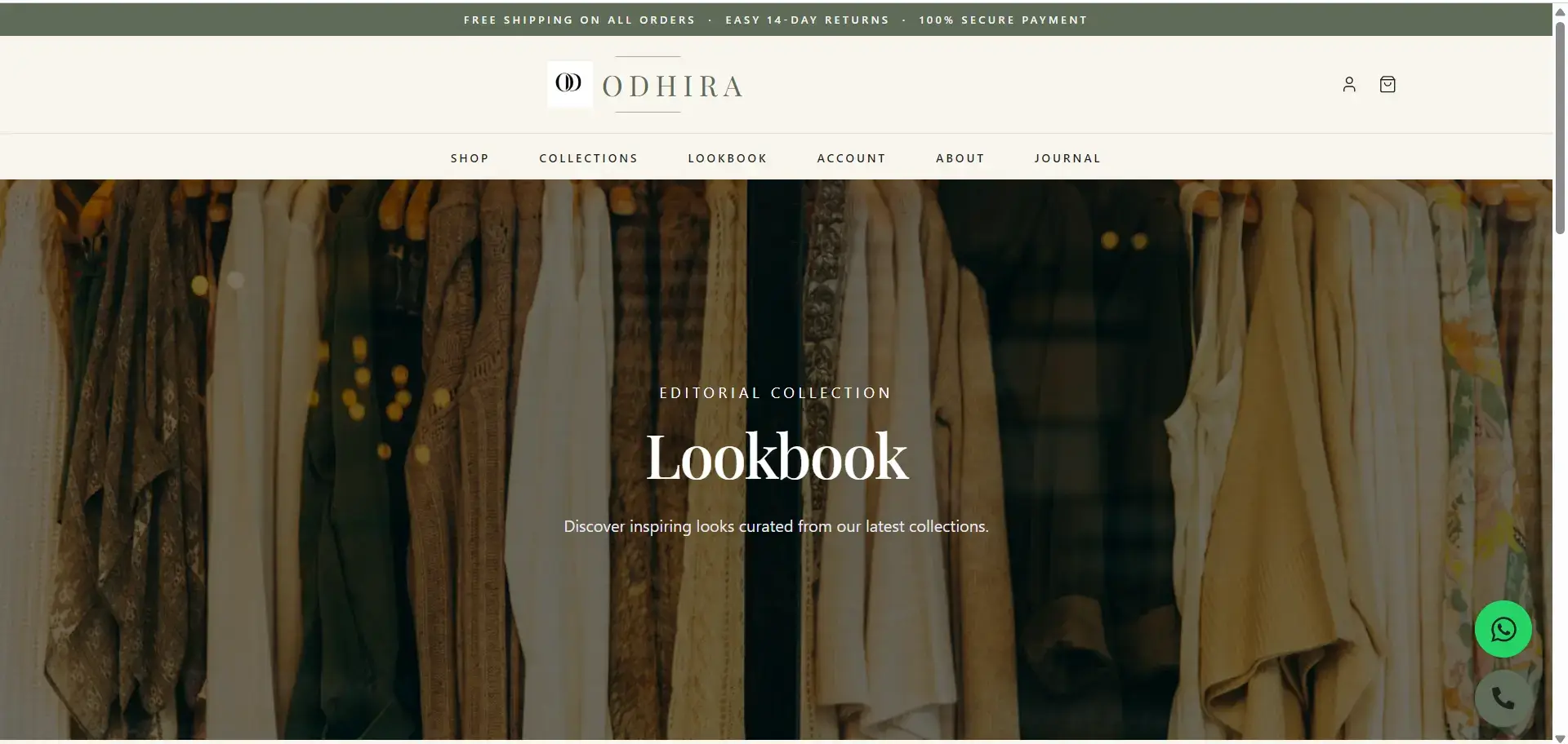
A polished e-commerce experience designed and developed for Odhira Boutique, bringing product presentation, visual storytelling, and online shopping into one structured digital experience.
Project Overview
Turning a boutique brand into a more polished online shopping experience.
Odhira Boutique was developed as an e-commerce experience with a strong focus on product presentation, visual appeal, and a smoother customer journey.
Rather than treating the website as a simple collection of pages, the experience was structured around the way an online shopper discovers a product, explores its details, builds confidence, and moves toward purchasing.
The goal was simple: make the digital storefront feel polished, easy to explore, and aligned with the boutique identity.
Client / Industry
A boutique e-commerce experience where visual presentation matters.
Odhira Boutique falls into the beauty and e-commerce space, where brand presentation and product discovery play a major role in the customer&aposs online experience.
E-commerce
Built around product discovery and online shopping.
Boutique Feel
A refined visual direction designed to support the brand.
Responsive
Designed for a consistent experience across screen sizes.
The Challenge
Creating an online storefront that looks premium without getting in the way of shopping.
E-commerce websites have to balance two things at the same time: visual impact and usability. Too much visual noise can make products harder to discover, while a purely functional layout can make a boutique brand feel generic.
The challenge was therefore to create a more refined experience while keeping navigation, product presentation, and the customer journey straightforward.
Our Approach
From brand understanding to a complete storefront.
We followed a structured process to make sure the final website balanced aesthetics, usability, and e-commerce functionality.
Understand
We first focused on understanding the brand, its products, and how customers should move through the online shopping experience.
Structure
Product-focused content was organized into a clear website structure so visitors could browse, discover, and understand products more easily.
Design
The visual direction was built around a polished boutique aesthetic while keeping the interface practical and easy to navigate.
Develop
The design was translated into a responsive e-commerce experience with reusable sections and a consistent visual system.
Refine
The final experience was refined around usability, responsive behavior, content hierarchy, and a smoother path toward shopping.
Design
A clean visual system that keeps the products in focus.
The design direction was intentionally focused on clarity. Visual details support the boutique identity, while the interface avoids unnecessary complexity around the shopping journey.
Boutique Visual Direction
A refined interface helps the brand feel more premium while keeping the products at the center of attention.
Product First
The experience gives product discovery and presentation a central role throughout the website.
Responsive Experience
The interface is designed to remain usable and visually consistent across desktop, tablet, and mobile screens.
Shopping Focused
The layout is structured around helping visitors move naturally from discovery toward product interaction and purchase intent.
Development
Building the interface around a practical shopping experience.
Once the visual direction was established, the website was developed with a focus on responsiveness, reusable components, content structure, and a consistent user experience across the storefront.
Development Focus
Performance, structure and usability
The implementation was shaped around a scalable interface where product-focused sections could work consistently across different screen sizes.
Key Features
The important parts of the experience were designed around how customers actually shop.
Final Result
A more complete digital storefront for Odhira Boutique.
The final result is a polished e-commerce website that gives the boutique a stronger online presence while making the shopping journey more structured and visually engaging.
A stronger digital presence for the boutique brand
A cleaner and more structured shopping experience
Improved product-focused content hierarchy
A polished responsive interface across devices
A clearer path from product discovery toward purchase intent
We have intentionally not added fabricated sales, traffic, conversion, or revenue figures to this case study. Quantitative results should only be published when they can be verified from the actual project.
Live Website
See the Odhira Boutique experience live.
Explore the live website to see the final storefront, product presentation, and overall shopping experience.
Visit odhiraboutique.comFAQ
About the Odhira Boutique project.
What did StackCraft Studio build for Odhira Boutique?
StackCraft Studio designed and developed the Odhira Boutique e-commerce website, focusing on visual presentation, product discovery, responsive design, and the overall online shopping experience.
What industry is Odhira Boutique in?
Odhira Boutique is presented as a beauty and e-commerce project, with the website centered around online product presentation and shopping.
Was the website designed for mobile users?
Yes. The case study is built around a responsive experience so the website remains usable and visually consistent across different screen sizes.
Have a project in mind?